Move over, Pinterest!
This summer, Garden horticulturists share their favorite plants and landscape design tips in a special series perfect for those who are eager to add pizzazz to their yards, and for homeowner associations looking to refresh community spaces.
These simple concepts, illustrated with photos from the Garden, are certain to inspire. With rainy season upon us, now is the perfect time to get planting.
Andrea Grace, Associate Director of Horticulture
Andrea’s Favorite Design Tips
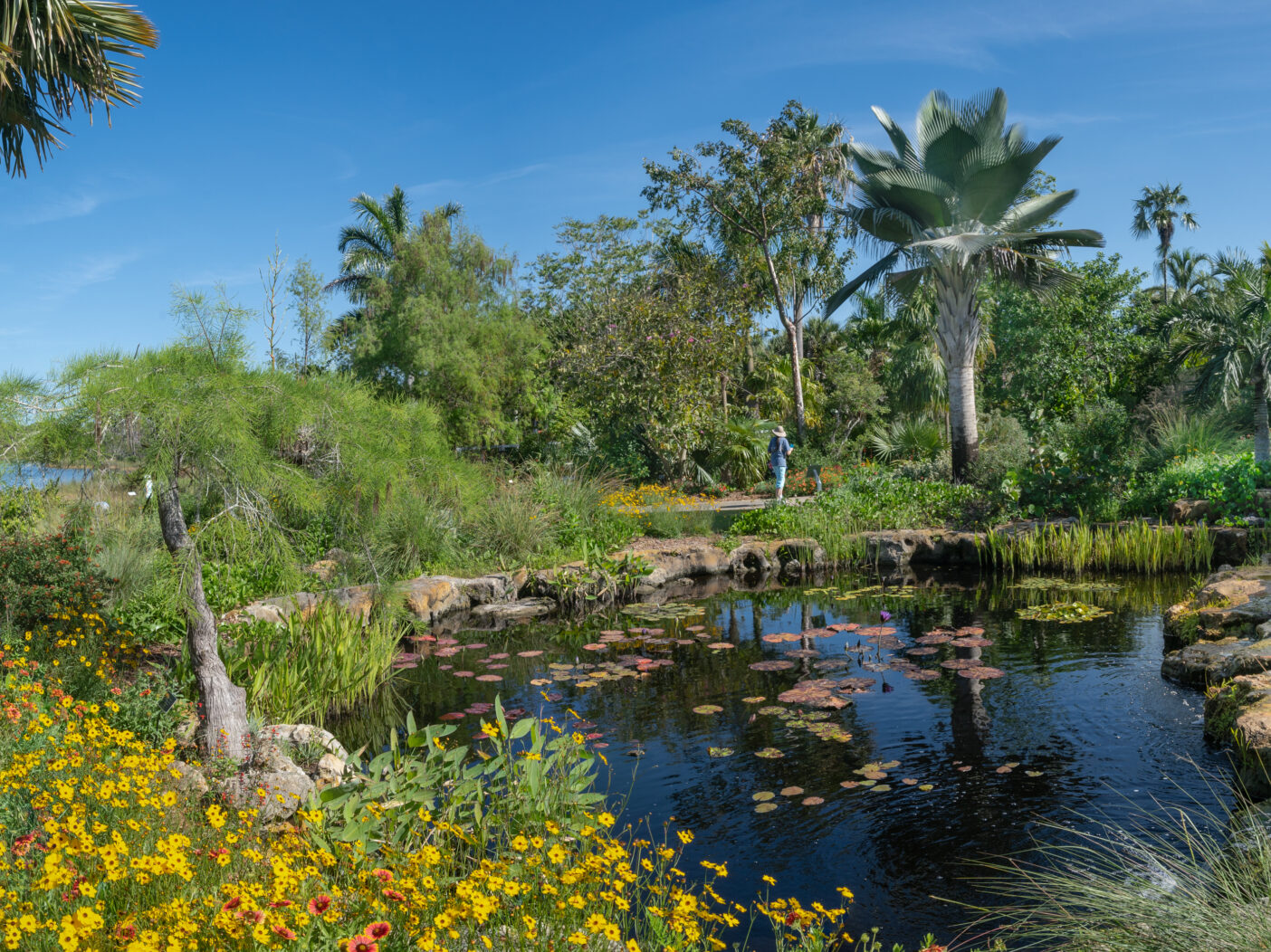
- Texture is a very important element to add interest to your garden designs. The use of different foliage shapes, as well as heights, catch attention in any garden landscape. Grasses or a plant with a thin wispy leaf can be used for a softer texture paired next to a Cordyline that has a large solid leaf. Using different textures brings variety and makes each individual plant stand out from the others.
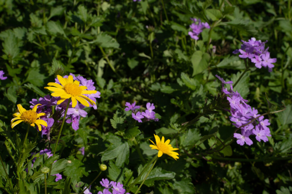
- Color is another way to add interest to your garden. You can use a monochromatic palette with varying plants of the same color, or you can have a mix of 3 – 5 colors to make a landscape look more like a wildflower meadow.
Andrea’s Favorite Plants to Use
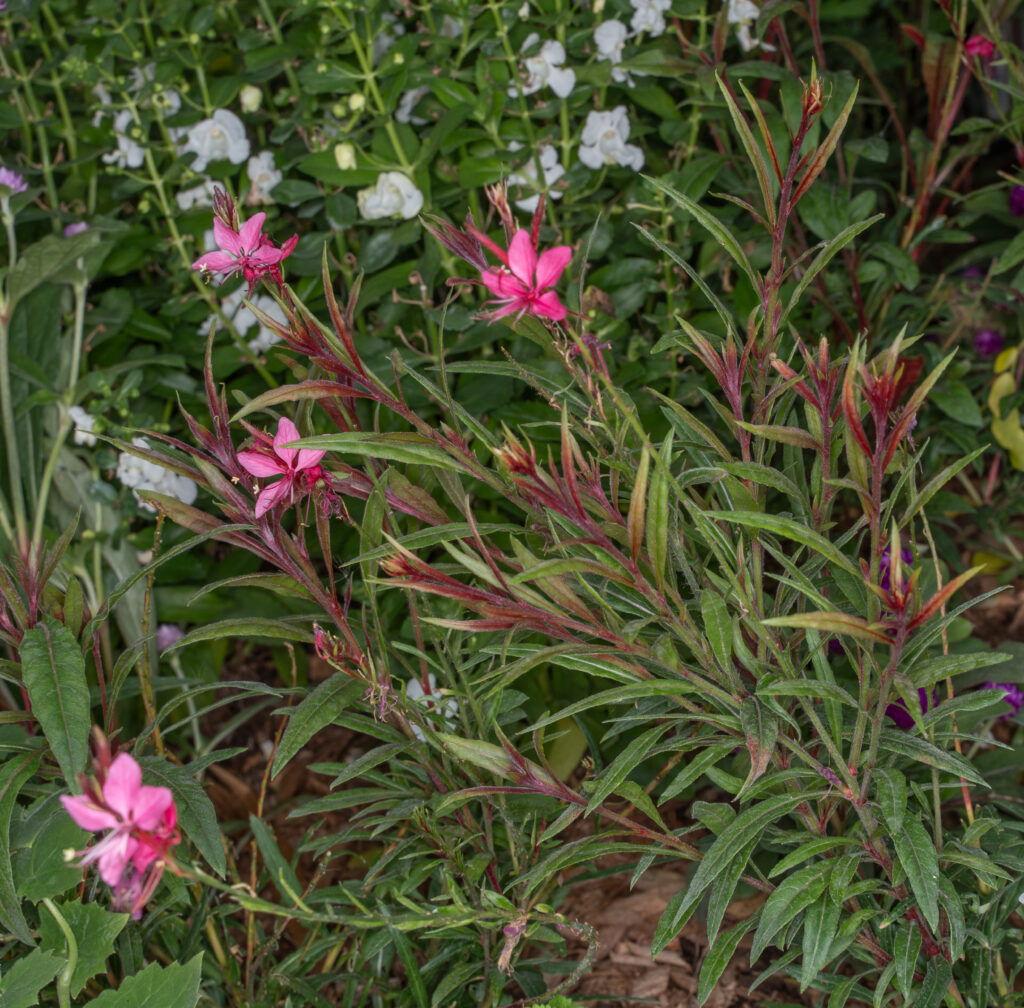
Gaura lindheimeri ‘Whirling Butterflies’ is a must-have in an annual planting. It brings a wispy height with a delicate flower that looks very similar to a butterfly, giving it its common name. There is a white and a pink variety. I would suggest planting them in a mass and closely together to give a whimsical feel to your annual display.
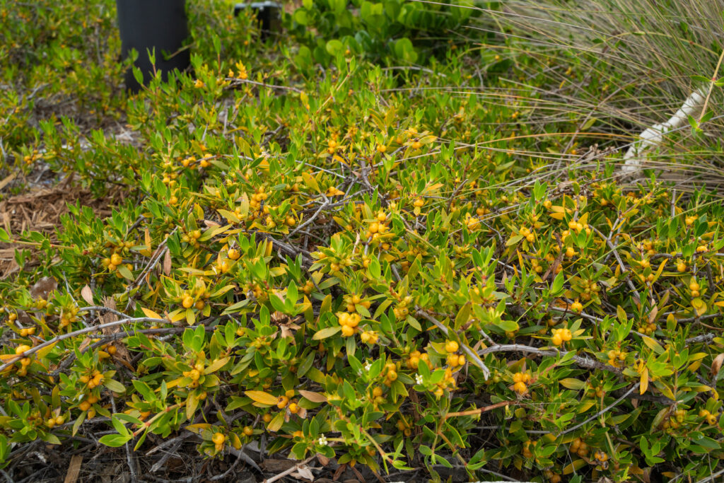
With a maximum height of 2 – 3 feet, the golden creeper (Ernodea littoralis) is a rock-star plant that creates a perfect groundcover layer for any landscape bed. I like to pair it with shrubs and trees. Using a groundcover layer is important for plant diversity—and, as a bonus, it also prevents weeds from taking root.
Putting It All Together
This bed, in the Scott Florida Garden, is a mosaic of textures, from fan-like palm fronds to wispy ornamental grasses to soft, floral petals.
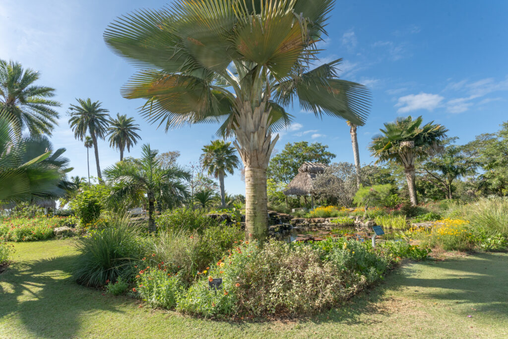
Annual flowers add instant color and personality to any yard. In this case, we used purple and yellow, which fall on opposite sides of the color wheel, to create an appealing contrast.